As I write, My Virtual Assistant has built over 70 websites and it saddens me when I open up a website which has so obviously been 'home-made' by the business owner or built for them by a friend or family member.
A tell-tale sign of a 'home-made' website is often a massive image, with no text and no clickable links to other areas of the website. No obvious links or calls to action on a website Home page are an incredibly missed opportunity.
A telltale sign of a 'home-made' website is often a massive image, with no text and no clickable links to other areas of the website. No obvious links or calls to action on a website Home page are an incredibly missed opportunity.
Then, after scrolling down below the oversized image, website visitors are often confronted with a large block of text which goes from one side of the page/screen to the other. This block of text most likely has no titles, no subheadings, and no images to break up the text.
Stick to what you know. It doesn’t matter if you sell clothing, cosmetics, jewellery, or you’re a business owner who is an accountant, electrician, massage therapist, etc, you really should stick to focusing on what you do best - that is, working as an accountant, electrican and so on.
I shudder to think how many clients a small business owner is losing because a website visitor has not bothered to scroll beyond the super huge image, or because they haven’t read through the uninspiring solid block of text, or even visited another page because there is no obvious link (call-to-action) enticing the visitor to delve deeper into the website. And even worse, missed out an opportunity because the contact information is not clearly visible on every single page.
A website doesn’t have to cost the earth. 'Saving money' with a do-it-yourself website is effectively harming your business, especially when your site consists of oversized images; large blocks of text, which may read perfectly well, but don’t attract the reader, appearing dull and boring because it’s nothing but words and most likely all in the same font and all in the same colour.
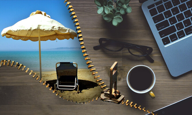
It’s not all about you. With summer holidays just around the corner and 2018 almost upon us, take time (while you are relaxing on the beach) to consider how your website is looking. Does it genuinely focus on your clients/customers or is your website 'all about you'? Sure, people might want to know about you and your business, but what they really want to know is what's in it for them.
Do you use the words 'I', 'me', 'us' and 'we' throughout your website? Client focused, savvy business owners will avoid using these words as much as possible and replace them with 'you' and 'your' wherever they can.
Do away with those large blocks of uninteresting text. Break up your website text into bite-sized paragraphs and use columns if you can.
A larger font for a heading with a slightly smaller font for a sub-heading is a fantastic way to make text more enticing and less daunting to read than a solid block of wording.
Use your logo colours for headings and subheadings making sure you don’t go overboard with too many colours - sticking to no more than two or three colours is a good rule of thumb. Avoid underlining as this can make text appear as a link, instead, try using a different colour for your links, or maybe bold your text-links to make them stand out.
(continued below)

Photographs are crucial. How are the photographs on your website? Do they reflect your business and what your business stands for? Or is your site full of generic images of flowers and butterflies, which is of course fine if you are a florist or lepidopterist, but not fine if you are a motivational speaker or wedding celebrant.
Are your images of a good quality or do they look pale or grainy? There are some fantastic stock image websites available online which offer a huge variety of high resolution images and it’s worth taking the time to scroll through these to find appropriate images for your business.
Do you have up-to-date photographs of your staff, and if you do, do your team members look natural, happy and smiling, or do their photos look like passport photos - full frontal, straight faced and looking like they're in need of a holiday.
Are the images bright enough for people to see their faces, or are they dark and shadowy? Is the background clear or is it full of clutter? Lots of clutter behind your staff member could cause your website visitor to get distracted by what's going on in the background.
Have you used photos of you or your staff member/s which were taken at a wedding or Christmas party? Sure, they might look happy and be dressed nicely, although a tuxedo or santa hat is probably not the best look for a plumbing business. Does the photo reflect the image you are truly trying to convey for your business, or is that glass of wine in your staff member's hand a tad inappropriate?
Are your product images brightly lit and clear..? If you are struggling to find great photos for your website then support a fellow business owner and contact a good, local photographer. Professional photos are a worthwhile investment and they can also be used on your social media pages, signage and printed matter.
Is your website performing? With so much competition out there, can you really afford to have a substandard website? And if your website is home-made, are you attracting the customers you would like? Are you aware of the statistics area on your site? Can you see how many visitors your site is attracting and which pages are being looked at the most?
A website that showcases who you are and what you do is imperative to the success of your business. If this is even slightly ringing any bells pertaining to your own website, then it’s time to give up the do-it-yourself version and take the right steps to getting a fresh, new, contemporary site which successfully represents your business.
(continued below)
Take the time to look at your website with fresh eyes. How your website is perceived by a potential client/customer who is looking for information about your business is an important factor to consider.
So, while you are enjoying some quiet time on the beach this summer, pick up your tablet or smartphone and open up your website.
Pay attention as to how quickly your site loads.
What is the very first thing you see and are you drawn to anything in particular?
Does your Home page make you want to click on a link to make a purchase or visit another page?
Take a seriously good look at your website as if you are a potential customer seeing it for the very first time.
Be honest with yourself. How does your website really look?